By Benedict Wee
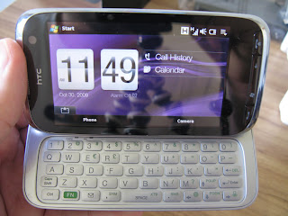
The courier dropped by with Telecom NZ's HTC Touch Pro2 to test out for the upcoming issue of In Business so I thought I'd post some first impressions of the phone here before doing a full in-depth review:
12.05 pm : Package just arrived. Opened it up. Cool HTC box with an XT Network sticker on the top right hand corner.
12.10 pm : Opened the box, contents inside include:
- The HTC Touch Pro2 smartphone
- A USB wire (that charges the phone and connects to the PC)
- A USB socket charger
- A Leather case (Kinda ugly one at that)
- Mini-USB headphones
- A Battery
- An extra stylus
- A screen protector (Nice. It's considerate of them to include one, being a touchscreen phone an all.)
12.15 pm: Phone feels solid and bulky, but in a good way. Makes you feel very business-like. Its size and shape betray its weight as it is pretty light (178.5g).
12.30 pm: Fiddled with the back cover in an attempt to put the battery in. Gave up and consulted the manual. Finally got the cover open and turned on the phone.
12.35 pm: The initial start-up is pretty slow but it's expected as Windows Mobile phones take some time to load when you first turn it on.
12.36 pm: Phone's up and running. Wow, TouchFlo runs really smoothly, no lag whatsoever. Graphics are crystal clear despite the reflective screen (which seems to catch my image every time I take a photo/video of the mobile).
12.45 pm: Physical keyboard slides out with a solid "click". Keys immediately light up and the screen is automatically adjusted to landscape mode. Tilting the screen upwards feels natural, turns the phone into a mini-notebook which is pretty neat. Typing on the physical keyboard feels good, keys are soft yet responsive.
1.00 pm: Testing out the XT network with the browser and Youtube application. Sites and videos are loaded fast enough to be considered near-broadband speeds. I'm pretty impressed.
2.00 pm: Just realized that I have not used the stylus at all. The HTC TouchFlo user interface is pretty amazing, everything is finger friendly (even the virtual keyboard) and transitions from one program to the other are seamless, you wouldn't know the phone is running Windows Mobile if not for the logo on the Start bar located at top left corner of the screen.
First Impressions Summary:
So far, I'm loving this smartphone. Though many would discount its size and shape, it is good to remember that the Touch Pro2 was designed with business professionals in mind. I can't see college students nor your average-kiwi wanting to own one of these but I do think that this phone could be a shining statement of individuality and style for those working in the CBD area where BlackBerries are commonly found.
Look out for my full review next week.


No comments:
Post a Comment